05:00
Week 13 Completed File
Intermediate Modeling

In the second part of the course we will leverage the following resources:
- The Tidy Modeling with R book second portion of the course book
- The Tidy Models website second portion of the course website
Link to other resources
Internal help: posit support
External help: stackoverflow
Additional materials: posit resources
While I use the book as a reference the materials provided to you are custom made and include more activities and resources.
If you understand the materials covered in this document there is no need to refer to other resources.
If you have any troubles with the materials don’t hesitate to contact me or check the above resources.
Class Objectives
- Interpreting the results and making future prices predictions.
Load packages
This is a critical task:
Every time you open a new R session you will need to load the packages.
Failing to do so will incur in the most common errors among beginners (e.g., ” could not find function ‘x’ ” or “object ‘y’ not found”).
So please always remember to load your packages by running the
libraryfunction for each package you will use in that specific session 🤝
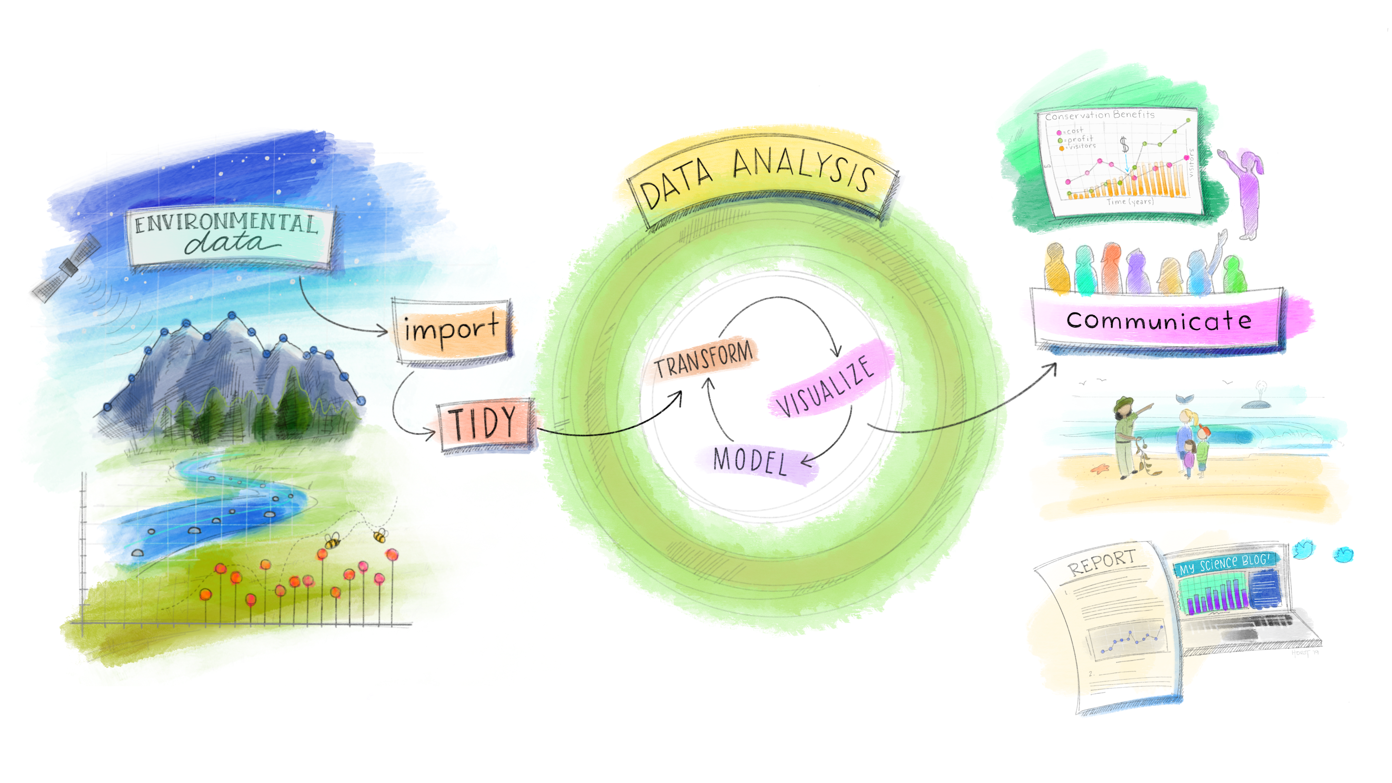
The tidymodels Ecosystem in action
Recap
In the previous weeks we have made some repetitive transformations (e.g., log Sale_Price) and encountered constant issues with our dataset (e.g., upper and lower case columns names). It is now time to clean the data and make model independent useful manipulations before moving back to modeling
Caution
I have removed the variables that are highly correlated with the variables we will use in the models below. Remember with mutate we have created those variables from existing variables in our dataset. If you don’t remove them they will bias your results due to multicollinearity (high correlation with the original ones).
Check variables correlations
Check variables correlation second.
A positive (blue) or negative (red) correlation between two variables indicates the direction of the relationship between them. The closer the correlation coefficient is to +1 or -1, the stronger the linear relationship between the variables. A correlation of 0 indicates no linear relationship.
Data Splitting
When it comes to data modeling (and model evaluation), one of the most adopted method is to split the data into a training set and a test set from the beginning. Here’s how this simple method can be implemented and its implications:
Example: Making prediction and evaluating different models’ prediction performance with data splitting
It is time to use a practical example to see how we can define different models and how we can assess them. We will explore the predictions’ outcome among different models and different recipes customized to the restrictions/needs of the different models.
Setting up the example recipes
Important
In real life you should prep and bake recipe 1 and 2 to verify that the preprocessing steps applied lead to the desired outcomes.
Specifying the models
We will specify two regression models and a decision tree-based model using parsnip. Please see below a brief overview of the models we will use to create and evaluate predictions:
- Linear Regression
When to Use: Ideal for predicting continuous outcomes when the relationship between independent variables and the dependent variable is linear.
Example: Predicting house prices based on attributes like size (square footage), number of bedrooms, and age of the house.
- Lasso Regression
When to Use: Similar to Ridge regression but can shrink some coefficients to zero, effectively performing variable selection (L1 regularization). Useful for models with a large number of predictors, where you want to identify a simpler model with fewer predictors.
Example: Selecting the most impactful factors affecting the energy efficiency of buildings from a large set of potential features.
- Decision Tree
When to Use: Good for classification and regression with a dataset that includes non-linear relationships. Decision trees are interpretable and can handle both numerical and categorical data.
Example: Predicting customer churn based on a variety of customer attributes such as usage patterns, service complaints, and demographic information.
Fitting the models using workflows
Next, we fit the models to the ames_train dataset because we want to assess their predictions performance on the ames_test. This is accomplished by embedding the model specifications within workflows that also incorporate our preprocessing recipes.
Regression models workflows
Tree-based models workflows
Important
Don’t worry we will learn how to interpret and visualize these models in the next class.
Model Comparison and Evaluation
Before learning how to interpret all the models results, we will learn to assess their performance (there is no point in interpreting them if they perform poorly or are “bad” models). This involves making predictions on our test set, and evaluating the models using metrics suited for regression tasks, such as RMSE (Root Mean Squared Error) or MAE (Mean Absolute Error) or R² (Coefficient of Determination).
Making predictions and Evaluating Model Performance with Data Splitting
Regression models predictions
Important
Can we compute the difference between the sale_price and the predicted price? What about the sum of the errors? [hint: use mutate and summarize]
Tree-based models predictions
Caution
If you guys noticed when we run predictions using the linear regression model with recipe2 (recipe2_predictions_reg) we got a warning. The warning indicated some rank-deficiency fit. This is usually due to:
the presence of highly correlated predictors (multicollinearity). Multicollinearity indicates that we have redundant information from some highly correlated predictors, making it difficult to distinguish their individual effects on the dependent variable.
the presence of too many predictors in our model. If the model includes too many predictor variables relative to the number of observations, it can lead to a situation where the predictors cannot be uniquely identified. Meaning that there isn’t enough independent information in the data to estimate the model’s parameters (the coefficients of the predictor variables) with precision.
Possible solutions are check for multicollinearity and using correlation matrix to identify and then remove highly correlated predictors. Or reduce the number of predictors by performing Principal Components Analysis (PCA). PCA is beyond the scope of this class but regularization methods (e.g., Ridge or Lasso regression) are designed to handle multicollinearity (Ridge in particular), high number of predictors (Lasso in particular) and overfitting. For this reason we don’t get a warning when we run the lasso model using recipe2.
In conclusion, while the linear regression model with recipe2 runs (and produce just a warning), we should not attempt to interpret the results because they can misleading and lead to bad decisions. For illustrative scope we will keep that model in but we know that in real life we will have to make changes to what predictors are included in it.
Creating Model Metrics to Assess Model Prediction Performance
While seeing the predictions next to the actual house values can already provide some insights on the goodness of the model. In regression analysis, model performance is evaluated using specific metrics that quantify the model’s accuracy and ability to generalize. Three fundamental metrics are Root Mean Squared Error (RMSE) , Mean Absolute Error (MAE), and R-squared (R²):
- Root Mean Squared Error (RMSE):
- What It Measures: RMSE calculates the square root of the average squared differences between the predicted and actual values. It represents the standard deviation of the residuals (prediction errors).
- Interpretation: A lower RMSE value indicates better model performance, with 0 being the ideal score. It quantifies how much, on average, the model’s predictions deviate from the actual values.
- Something to consider: RMSE is sensitive to outliers. High RMSE values may suggest the presence of large errors in some predictions, highlighting potential model weaknesses.
- Mean Absolute Error (MAE):
- What It Measures: MAE quantifies the average magnitude of the errors between the predicted values and the actual values, focusing solely on the size of errors without considering their direction. It reflects the average distance between predicted and actual values across all predictions.
- Interpretation: MAE values range from 0 to infinity, with lower values indicating better model performance. A MAE of 0 means the model perfectly predicts the target variable, although such a scenario is extremely rare in practice.
- Something to consider: MAE provides a straightforward and easily interpretable measure of model prediction accuracy. It’s particularly useful because it’s robust to outliers, making it a reliable metric when dealing with real-world data that may contain anomalies. MAE helps in understanding the typical error magnitude the model might have in its predictions, offering clear insights into the model’s performance.
- R-squared (R²):
- What It Measures: R², also known as the coefficient of determination, quantifies the proportion of the variance in the dependent variable that is predictable from the independent variables. It provides a measure of how well observed outcomes are replicated by the model.
- Interpretation: R² values range from 0 to 1, where higher values indicate better model fit. An R² of 1 suggests the model perfectly predicts the target variable.
- Something to consider: R² offers an insight into the goodness of fit of the model. However, it does not indicate if the model is the appropriate one for your data, nor does it reflect on the accuracy of the predictions.
Regression models performance metrics
Decision tree models performance metrics
Identify the best model using models’ metrics
Decide which model to proceed with should be based on these metrics, considering RMSE [lower values better], MAE [lower values better] and R² [higher values better]. Sometimes the best model is the one that gives the best compromise among those metrics. They are not always in agreement. Moreover, keep in mind that the choice of model might also depend on other factors such as:
Interpretability and complexity of the model.
Computational resources and time available.
The specific requirements of your application or project.
Let’s check all the models metrics to establish the best model keeping in mind the above bullet points.
Combine All Metrics and Compare
Based on the results above we can conclude that:
The linear regression model with recipe 2 has the best MAE. However, that model is troublesome (remember the warning) and it would be very hard to interpret.
The decision tree model with recipe 4 is the best model metrics wise, it has the second lowest MAE and the best RMSE and RSQ. Decision tree are usually easy to interpret but using all the predictors might be challenging and unnecessary (more parsimonious models that lead to similar results are preferred).
Unfortunately, the more parsimonious/simpler models (e.g., recipe 1 and 3 models and lasso with recipe 2) are not close to the best models in terms of performance. So, it seems that none of the above models is truly optimal for our needs. However, we have some indications of the direction for our next model: include more than 2/3 predictors (not performing well enough) but not all predictors (too complex and harder to interpret). We will use the activities below to try to improve the current model performance.
Activity 3: Comparing and evaluating models new models - 30 minutes
[Write code just below each instruction; finally use MS Teams R - Forum channel for help on the in class activities/homework or if you have other questions]
Build a new recipe that use only numeric variables with strong positive correlation with sales price (log version) [hint: remember to create correlation matrices]. Make sure all the independent variables are standardized. Include also overall_cond and neighborhood as dummy variables. Call this recipe as “recipe_3a”.
Note
In this case I am assuming variables above +0.5 as “strong” positive correlation. Please keep in mind that this is my assumption because I am not a real estate expert. Moreover, always remember that what is considered strong in one industry might be considered weak in another industry; so always do some research on the industry determined thresholds.
Based on the 0.5 threshold we will use year_built, year_remod_add, gr_liv_area, garage_cars , garage_area, total_sf, total_bath to predict price_log (plus the two categorical columns overall_cond and neighborhood). Please note that we have kept variables highly correlated with each other because it wasn’t mentioned to exclude them in the instructions. However, we will probably have multicollinearity issues with this recipe. Please remember to always check also the correlation between independent variables and to avoid putting in your model highly correlated independent variables.
Define a new ridge regression model using parsnip. Name the model as “linear_mod_ridge”. Make sure to use the right arguments to perform ridge regression.
Create 5 new workflows: 1) linear regression model with recipe_3a (recipe3a_workflow_reg); 2) lasso regression model with recipe_3a (recipe3a_workflow_lasso); 3) ridge regression model with recipe1 (recipe1_workflow_ridge); 4) ridge regression model with recipe2 (recipe2_workflow_ridge); 5) ridge regression model with recipe_3a. (recipe3_workflow_ridge).
Make predictions using the 5 new workflows. Call the prediction as recipe3a_predictions_reg, recipe3a_predictions_lasso, recipe1_predictions_ridge, recipe2_predictions_ridge, recipe3a_predictions_ridge.
Calculate for each one of the above RMSE, MAE and R-squared. Use similar naming convention used in the example above. Make sure to put the metrics in a new tibble. Make sure the tibble also contains the previous models results. Compare the results with the old ones. Which one is the best model in making predictions?
End of Recap
Visualizing Results
Now that we have assessed the model with metrics, it is time to visualizing the prediction results to get an intuitive insights into model performance. There are two types of plots that are extremely useful to assess linear regression models.
1. Overlayed Prediction Error Plot
An Overlayed Prediction Error Plot is a type of diagnostic plot used to evaluate a regression model’s performance by showing how predicted values compare to actual values, with an overlay that reveals the distribution of errors. Here’s how it typically works and what it looks like:
Scatter Plot of Predictions vs. Actuals: The main plot includes a scatter plot where the actual values are on the x-axis and the predicted values are on the y-axis. Each point represents a single observation from the dataset, with the position indicating the actual vs. predicted outcome.
Diagonal Reference Line: A diagonal 45-degree line is usually added from the origin (bottom left) to the top right. This line represents perfect predictions—points lying exactly on this line indicate that the predicted value matches the actual value.
Error Visualization: Errors (or residuals) are visually displayed based on the deviation of points from the diagonal line. If a point lies above the line, it indicates that the model has over-predicted for that observation. If it lies below the line, the model has under-predicted.
Interpretation
Above the Diagonal: Points above the line mean the model’s predictions are higher than the actual values (over-prediction).
Below the Diagonal: Points below the line mean the model’s predictions are lower than the actual values (under-prediction).
Concentration of Points: A dense cluster of points near the diagonal suggests accurate predictions in that range, while a spread out pattern indicates more variability or error in predictions.
Why It’s Useful
This plot provides a quick visual of:
Whether there is bias in the predictions (e.g., if most points lie consistently below or above the line).
If errors vary across the range of the target variable.
Any systematic patterns in the residuals, which may suggest the model is missing important relationships or could benefit from transformations or adjustments.
Now let’s check the plot for the best and worst model according to the above metrics:
Best Model
When interpreting scatter plots comparing actual values to predicted values, especially for regression models, the ideal scenario is for the points to closely align with the diagonal line. The diagonal line represents perfect prediction accuracy, where the predicted values exactly match the actual values. Here’s how to interpret the charts and understand the nuances of good versus concerning patterns:
Points Around the Diagonal
If your linear model points are scattered around the diagonal, it suggests that the model’s predictions are generally in agreement with the actual values. The closer the points are to the diagonal, the more accurate the predictions.
Good Chart Indicators:
Tight Cluster Around Diagonal: Points tightly clustered around the diagonal line indicate high prediction accuracy.
Even Spread Without Bias: Points evenly spread above and below the diagonal line suggest that the model doesn’t systematically overestimate or underestimate the target variable.
Actions Based on Chart Interpretation
If the linear model shows points closely around the diagonal, it suggests your model is performing reasonably well. Consider if any slight biases or patterns arise. In our case the model seems to perform very well until 200k actual price. However, past that it tends to under-predict the sale price. Possible explanation are:
Non-linear Relationships: Your model might not capture non-linear relationships between features and the target variable. Consider transforming your predictors (e.g., using polynomial features, square roots, logarithms) to better capture non-linearity.
Feature Engineering: Additional features that specifically influence higher-valued homes might be missing from your model. Think about aspects that significantly impact more expensive homes (e.g., luxury amenities, neighborhood prestige) and try to include these in your model.
Incorporate Interaction Terms: Some predictors might have different effects on the response variable at different levels of other predictors. Adding interaction terms to your model can help capture these effects and improve predictions for higher-valued homes.
Use a More Flexible Model: Our regression model might not be flexible enough to capture complex patterns in your data. Consider switching to more complex models that can capture non-linear relationships, such as random forests, gradient boosting, or even neural networks for deep learning approaches. These models can better adapt to varied patterns in the data.
Note
It is also possible that a model systematically under-predict higher house prices because there are fewer high-priced houses in the dataset. When a dataset is imbalanced like this (where high-priced houses are underrepresented compared to lower or mid-priced houses), the model may struggle to accurately learn patterns in the higher price range. This is common in regression models, especially when using techniques that tend to minimize overall error, as they may focus more on the range with more data.
Now, what about the same chart but with the worst predictive model?
Worst Model
Steep Diagonal Line
A steep diagonal line in your model plot suggests that the relationship between the actual and predicted values isn’t proportional. While we expect a 1:1 relationship (perfect predictions) to follow a 45-degree line, a steeper or flatter line implies that the model’s predictions are not scaling linearly with the actual values. This might be due to an imbalance in regularization that disproportionately impacts the predictions for different ranges of actual values.
- Concerning Chart Indicators: Steep Line Away from the Ideal Diagonal: A steep diagonal line suggests that the model may be overfitting to a certain range of the data or is not generalizing well across the spectrum of actual values. This could also be indicative of missing important predictors in the model or of the presence of non-linear relationships in the data that the model isn’t capturing properly.
Actions Based on Chart Interpretation
This pattern suggest that ridge approach to regularization is way more effective than lasso in this case. That said it might be necessary to fine-tune penalty and mixture parameters further (beyond scope of the class). In general, if you notice a steep line I recommend the following:
Adjust Regularization Parameters: You may need to fine-tune the penalty and mixture parameters to find a better balance that allows the model to scale its predictions more accurately across all values.
Re-examine Feature Engineering: There might be missing variables in the model or non-linear relationships that are not being captured by the model. Consider adding polynomial features, interaction terms, or exploring different transformations.
Model Diagnostics: Look into residual plots and other diagnostic tools to better understand where the model is making errors and to guide further improvements.
Visualizing the comparison in one chart
When we look at the above charts, it seems clear that one of the models outperform the other. However, in situation like this it’s easier to make the comparisons among them when the models are in the same plot. More specifically, two plots are beneficial to make the comparison:
Overlaid Prediction Error Plot: This plot shows the predicted values against the actual values for all models:
Diagonal Line: Represents the line of perfect prediction. The closer the points to this line, the more accurate the predictions.
Dispersion: Points closely clustered around the diagonal line indicate high accuracy. If points for one model are closer to the line than another, that model has generally performed better. Bias: If points systematically deviate to one side of the line, it might indicate bias in the model predictions.
2. Overlaid Residuals Plot
An Overlaid Residuals Plot is a diagnostic plot used to assess a regression model by showing the residuals (errors between actual and predicted values) with overlays that highlight patterns or distributions within the residuals. This helps to identify potential issues with the model, such as bias, heteroscedasticity (variance that changes across the range of predictors), or systematic errors. Here’s how it typically works and what it looks like:
Residuals on the Y-Axis: The residuals (calculated as actual value minus predicted value) are plotted on the y-axis. Residuals above zero indicate that the model under-predicted (predicted value is lower than actual), while residuals below zero mean the model over-predicted.
Fitted Values on the X-Axis: fitted values (predicted outcomes) are used to examine if residuals vary systematically across the predicted range.
Reference Line: A horizontal line at zero serves as a reference, showing where the residuals would lie if predictions were perfectly accurate. Points ideally should scatter randomly around this line.
Interpretation
Randomly Scattered Residuals: If residuals are evenly scattered around zero with no pattern, this is ideal and suggests the model is well-fitted.
Patterns or Trends: Curved patterns or systematic deviations indicate the model may be biased (e.g., it could benefit from additional predictors or a transformation).
Fanning or Funnel Shape (Heteroscedasticity): A fanning shape, where residuals increase as fitted values grow, suggests heteroscedasticity, indicating that the model’s errors vary across the predicted range.
Why It’s Useful
This plot provides a quick visual of:
Detecting Model Bias: Identifying if the model consistently over- or under-predicts for certain values.
Checking Assumptions: Assessing linearity, homoscedasticity (constant variance), and normality.
Improving Model Fit: Highlighting areas where transformations or different models might improve accuracy.
Best Model
Point Around the 0 Line
- Residuals Scattered Around the 0 Line Up to $200,000
The residuals are evenly scattered around the zero line up to 200k, indicating that the model makes relatively unbiased predictions within this range. This is a positive sign for predicting values under $200,000.
- Increasing Positive Residuals Above $200,000
Beyond $200,000, residuals tend to be more frequently above the zero line. This pattern suggests that the model may be underestimating higher values, indicating that it doesn’t fully capture the relationship for higher-priced observations (this bias supports the likelihood of heteroscedasticity).
Actions Based on Chart Interpretation
Investigate Model Fit for High-Value Observations: Since the model appears to perform less effectively for values over $200,000, consider adding features or using a different model that can better capture higher-value predictions.
Consider Nonlinear Transformations or Interactions: Higher-priced data points may require nonlinear or interaction terms to be properly modeled, which could help the model capture trends in the upper range of values.
Validate Across Price Segments: Perform further validation to see if segmenting the data by value ranges (e.g., below and above $200,000) improves performance. If so, it may be worth considering a segmented approach or using different model structures across different price ranges.
Maintain Key Features: Keep the primary features and tuning parameters used in this model, as they contribute to its robustness.
Worst Model
Interpretation of the Funnel Pattern
Increasing Variability: The funnel pattern, where residuals spread out as fitted values increase, implies that the model’s accuracy decreases for higher values. The residuals are not evenly distributed around zero, showing that the model’s errors grow with the size of the predicted values.
Positive Bias in Predictions for Higher Values: If the positive residuals increase more steeply than negative residuals, it suggests that the model systematically underestimates higher values. This means that for high-value predictions, the model is less reliable and more likely to produce significant underestimations.
Implication of a Poor Fit: The funnel shape, combined with the upward trend in positive residuals, implies that this model is not capturing the true relationship between the variables well, especially for higher values. This poor fit often points to a model specification issue, where critical variables or relationships (such as non-linear effects) are missing.
Actions to Address the Pattern
To address the heteroscedasticity and improve the model’s performance, consider the following adjustments:
Transformations: Applying a log or square root transformation to the dependent variable can help stabilize variance and reduce heteroscedasticity (we already did that).
Adding Nonlinear Terms or Interaction Terms: Incorporating polynomial terms or interactions between variables can improve the model’s ability to capture complex relationships, reducing systematic biases.
Visualizing the comparison in one chart
When we look at the above charts, it seems clear that one of the models outperform the other. However, in situation like this it’s easier to make the comparisons among them when the models are in the same plot. More specifically, two plots are beneficial to make the comparison:
Overlaid Residuals Plot: The overlaid residuals plot displays the residuals (the differences between the actual and predicted values) of the models across the range of predicted values. Here’s what to look for:
Zero Line: The dashed line at y = 0 represents perfect predictions where the predicted values match the actual values exactly. Residuals above this line indicate under-predictions, and residuals below indicate over-predictions.
Spread of Residuals: A tightly clustered spread of points around the zero line suggests a model with smaller errors. Wider spreads indicate larger errors. Patterns: Ideally, residuals should be randomly distributed around the zero line, with no discernible pattern. Patterns or trends might indicate systematic errors in a model.
Important
Visual interpretations provide valuable insights into model performance but should be complemented with quantitative metrics (like RMSE, R²) for a comprehensive evaluation. Scatter plots help identify patterns or biases not immediately apparent from numerical metrics alone, offering a more intuitive understanding of model behavior.
By carefully analyzing these metrics and visualizations, you can make an informed decision about which model best meets your needs, taking into account both quantitative performance and practical considerations.
Activity 1: Model performance assessment, relevant metrics and visualizations. Write the code to complete the tasks below - 20 minutes
[Write code just below each instruction; finally use MS Teams R - Forum channel for help on the in class activities/homework or if you have other questions]
A step by step Linear and Ridge Regression Analysis. 1) Data Preparation: Split the ames_clean dataset into new training and testing subsets.
- Recipe: Target
price_logfor prediction. Add preprocessing: Construct a recipe that creates a new feature “outdoor_living_SF” (equal to the sum ofwood_deck_sf,open_porch_sf, andenclosed_porch). Include alsototal_sf,overall_cond, andneighborhoodas predictors.
- Model Specification: Specify two regression models using
parsnip: a Linear Regression model and a Ridge Regression model.
- Workflow Creation: Create a workflow for each model that incorporates the recipe and the model itself. Fit each workflow to the training set.
- Evaluation: Use the fitted workflows to predict
price_login the testing set. Assess the models’ performance using metrics such as RMSE, MAE and R-Squared. Which model is the best model? Why?
- Visualizing metrics: Generate a Overlaid Residuals Plot and an Overlaid Prediction Error Plot. Differentiate the models by color, using blue for the Linear Regression model and red for the Ridge Regression model. What indications are you getting from the charts?
What Makes a Good Model?
Now that we learned also how to visualize the models results it is time to summarize what makes a good model. Here are three elements you should always keep in mind before proceeding to model selection and interpretation:
- Accuracy:
- Essential for Trustworthy Predictions: Accurate models closely align predictions with actual observed values, enhancing the reliability of the insights or decisions derived from the model.
- Balancing Precision and Usability: While striving for accuracy, it’s crucial to ensure the model remains applicable and interpretable within its intended context.
- Generalizability:
- Performance Across Diverse Data: A model’s ability to perform well on unseen data, not just the data it was trained on, is vital for its utility in real-world applications.
- Robustness to Overfitting: Generalizable models resist overfitting, where a model learns the noise in the training data to the detriment of its performance on new data.
- Simplicity:
- The Principle of Occam’s Razor: When two models offer comparable performance, the simpler model is preferred. This principle, known as Occam’s Razor, suggests that simpler explanations are more likely to be correct than complex ones.
- Advantages of Simplicity: Simpler models are easier to understand, explain, and maintain. They are less likely to overfit and often require less data to train effectively.
In sum, understanding the key metrics that evaluate regression models provides insights into model performance, highlighting areas of strength and opportunities for improvement. A good model balances accuracy, generalizability, and simplicity, ensuring it can reliably predict outcomes and offer valuable insights into the phenomenon being studied.
Interpreting the best model results
Given that recipe3a ridge regression model gives the best results we will proceed to interpret its results.
What to Look at in the Ridge Regression Model Output:
- Coefficient (Estimate): The coefficient (or “estimate”) represents the relationship between each predictor and the log-transformed sale price.
Interpretation: A positive coefficient indicates that as the predictor increases, the log sale price tends to increase. A negative coefficient suggests the opposite. Since predictors are standardized, each estimate indicates the effect of a one-standard-deviation change in the predictor on the log-transformed sale price.
- Penalty: The penalty column shows the regularization parameter (lambda), which is set to 0.1 for all predictors in our model. This penalty term helps prevent overfitting by shrinking coefficients closer to zero. Ridge regression applies a uniform penalty across all coefficients, balancing between fitting the data well and keeping coefficients relatively small.
Important
We need to take into account that our dependent variable is log transformed on base 10. Moreover, we have to consider that all the predictors are standardized (mean 0, sd 1). Thus, this is the interpretation of the regression results:
Interpretation of Numerical Predictors:
Total Square Footage (total_sf): Interpretation: A one-standard-deviation increase in total square footage is associated with approximately
(10^0.0341−1)×100≈7.95%increase in sale price, holding other factors constant. This highlights how additional space contributes to higher property values.Total Bathrooms (total_bath): Interpretation: A one-standard-deviation increase in total bathrooms results in an estimated
(10^ 0.0197 − 1 ) × 100 ≈ 4.65 %increase in sale price, reinforcing the value added by more bathrooms.Garage Cars Capacity (garage_cars): Interpretation: A one-standard-deviation increase in the number of cars a garage can accommodate is associated with a sale price increase of approximately
(10^ 0.0168 − 1 ) × 100 ≈ 3.89 %, indicating that larger garage capacity adds value.Garage Area (garage_area): Interpretation: A one-standard-deviation increase in garage area is associated with a
(10^ 0.0160 − 1 ) × 100 ≈ 3.72 %increase in sale price, suggesting additional garage space may appeal to buyers.Year Built (year_built): Interpretation: A one-standard-deviation increase in the year built corresponds to a
(10^ 0.0209 −1)×100≈4.91% increase in sale price. This reflects the higher value often associated with newer properties.Year of Last Remodel/Addition (year_remod_add): Interpretation: A one-standard-deviation increase in recent remodels or additions leads to an approximate 4.64% increase in sale price equal to
( 10^ 0.0201 − 1 ) × 100≈4.64% , emphasizing the market preference for updated properties.
Interpretation of Categorical Predictors:
For categorical predictors, coefficients represent the effect of each category relative to a reference category (baseline). Below are examples based on overall_cond and neighborhood levels:
Poor (overall_cond_Poor): Interpretation: Compared to the baseline condition (e.g., “Very Excellent”), a “Poor” overall condition is associated with a
(10^−0.130 − 1 ) × 100 ≈ − 24.6 %decrease in sale price. This decrease reflects the negative impact of a poor condition on property value.College Creek (neighborhood_College_Creek): Interpretation: Properties in “College Creek” have an estimated
(10^ 0.00915 − 1 ) × 100≈2.16% higher sale price than those in the reference neighborhood (“Hayden Lake”) This suggests slight value differences across neighborhoods.Old Town (neighborhood_Old_Town): Interpretation: Properties in “Old Town” are associated with a decrease of about
(10^ −0.0439 − 1 ) × 100≈9.86% in sale price compared to the reference neighborhood (“Hayden Lake”), showing how location can impact property values.
Tip
Each coefficient can be similarly interpreted for remaining neighborhoods and overall conditions by calculating (10^estimate − 1 ) × 100, considering the positive or negative direction respective to the reference category to infer the effect on the sale price. Remember to compute the standard deviation of the independent variables to better understand the above values.
Visualizing Decision Tree to better interpret them
Now the second best model was a decision tree. Decision tree are easier to interpret when you visualize them. The following steps are needed to visualize a tree based model results.
Key Elements of the Decision Tree
Nodes:
Decision Nodes: Represent a split in the data based on a condition (e.g.,
total_sf < 2474).Terminal Nodes (Leaves): Represent the end of a branch, containing the predicted value for a subset of the data.
Splits:
A split occurs when the tree partitions the data based on a predictor variable (e.g.,
total_sf).Conditions at each split direct the data into smaller groups for improved homogeneity.
Branches:
Left Branch: Indicates that the condition at the split is satisfied (e.g.,
total_sf < 2474).Right Branch: Indicates the condition is not satisfied (e.g.,
total_sf >= 2474).
Predictions:
Each terminal node provides a predicted value for the log-transformed sale price.
These predictions are based on the characteristics of the subset of data reaching the node.
Proportions:
- Each terminal node also shows the percentage of data points in that node relative to the total dataset.
Tree Structure and Predictions
Root Node (Starting Point):
Condition: The entire dataset begins here.
Prediction:
log10(price)=5.2Converted Sale Price:
10^5.2≈158,489 USDInterpretation: The average predicted sale price for all homes is approximately $158,489.
Split 1: total_sf < 2474 (Left Branch)
Condition: Homes with less than 2474 square feet.
Prediction:
log10(price)=5.1Converted Sale Price:
10^5.1≈125,893 USDProportion of Data: 52% of the dataset observations.
Further Split: Based on neighborhoods (e.g., Old_Town, Edwards, Sawyer).
Neighborhoods Match Condition:
Prediction remains
log10(price)=5.1.Sale price approximately $125,893.
Interpretation: Smaller homes in certain neighborhoods are associated with lower prices.
Split 2: total_sf ≥ 2474 (Right Branch)
Condition: Homes with square footage of 2474 or more.
Prediction:
log10(price)=5.3Converted Sale Price:
10^5.3≈199,526 USDProportion of Data: 48% of the dataset observations.
Interpretation: Larger homes tend to sell for higher prices, with an average predicted price of $199,526.
Terminal Node: total_sf ≥ 4395
Condition: Homes with exceptionally large square footage (≥4395 sq. ft.).
Prediction:
log10(price)=5.7Converted Sale Price:
10^5.7≈501,187 USDProportion of Data: Represents a small subset of data.
Interpretation: Very large homes are associated with significantly higher sale prices, with an average prediction of $501,187.
Impact of Variables
total_sf (Total Square Footage):
Appears at the top of the tree, demonstrating its strong influence on sale prices.
Homes with larger square footage consistently predict higher prices.
Neighborhood:
- Plays a critical role in further splitting the data, reflecting the importance of location in determining home values.
Year Built and Year Remodeled:
- Influence predictions lower in the tree, indicating that newer or recently updated homes hold value.
Heterogeneity in Predictions
The tree divides homes into groups with similar characteristics, yielding homogeneous subgroups:
Smaller, older homes in specific neighborhoods predict lower prices.
Larger, modern homes predict higher prices.
Patterns to Note:
- Heteroscedasticity (Potential Issue): Variance in predictions increases for homes with higher square footage.
Decision Tree Insights
Practical Applications:
Homebuyers and real estate professionals can interpret the tree to assess how characteristics such as size and location affect prices.
total_sf(total square footage) is used at the highest levels, suggesting it’s a strong predictor of log sale price. Homes with larger square footage tend to have higher predicted sale prices.neighborhoodand variables likeyear_builtandyear_remod_addalso contribute, indicating these characteristics are relevant to the predicted price.
For example, investing in square footage or targeting specific neighborhoods or remodeling may increase property value.
Important
When you interpret the results above you have to account for the transformations applied to the dependent variable (e.g., log transformation) and predictors (e.g. standardization). Failing to do so will lead to misleading insights.